Appearance
Survey editing
To get to the Edit page, click  on the survey's thumbnail.
The survey will open in the Edit mode:
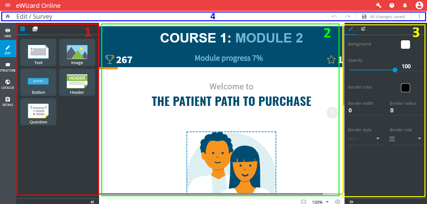
The Edit page includes the following areas:
The left toolbar contains two tabs:
ComponentsandStructure.The slide layout.
The component settings bar contains the
Stylesand thePropertiestabs.The editing controls field contains
Undo,Redo, andSave changes.
Undo discards the last action.
 Redo repeats the change discarded.
Make sure to save all changes before leaving the Editor.
The rounded white arrows  provide navigation between the slides.
To add or rearrange components, drag&drop them from Components tab into the slide layout. All survey components have the same Style settings, the essential difference is in the Properties tab:
Button
Interactive element to trigger an action.
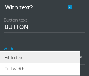
With text?shows/hides a text inside the button;Button textdefines the button's text;Widthdefines the button width (Fit to textorFull width). IfButton textis longer then maximum width, a new row will appear by means of increasing button's height
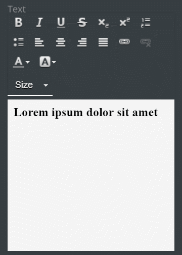
Header and text
Adds text and the heading text to the slide. Both components have the same formatting tools, and different fonts and font sizes:
Image
A basic element for adding images to the slide.
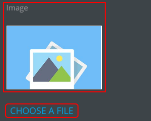
The Image block thumbnail shows the current image preview. Choose a file opens the Digital Assets form for a new image selection.
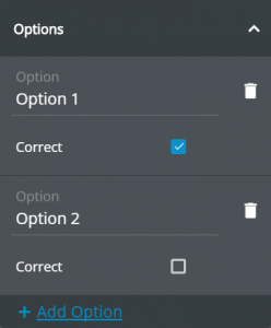
Question
The key component of a survey. Contains the question (configured in the Question tab of Properties), the answer options (Options tab) and the Submit button:
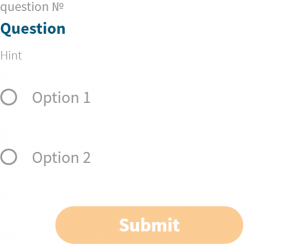
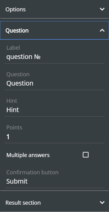
A learner presses Submit to confirm the answer(s). After submitting the Results popup appears (configured in the Result section tab of the question's Properties):

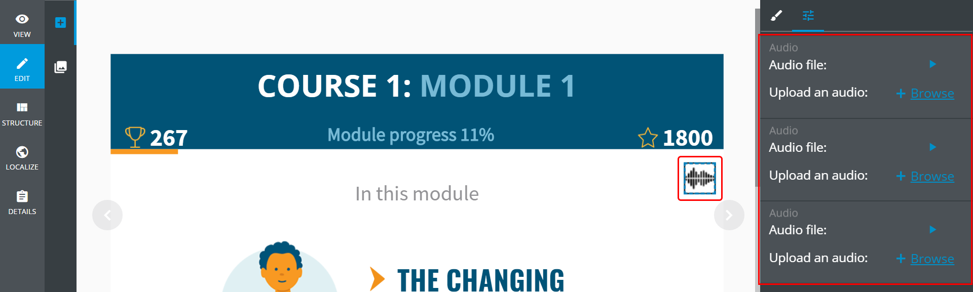
Audio
Audio is represented by  on the slide layout. It can be played and replaced with another one in the
 Properties tab: