Appearance
Edit component
The EDIT COMPONENT tab contains Styles, Properties, Actions, Animations and Monitoring tabs, where you can edit different features of the selected item. The amount of tabs and their content may differ depending on the element:
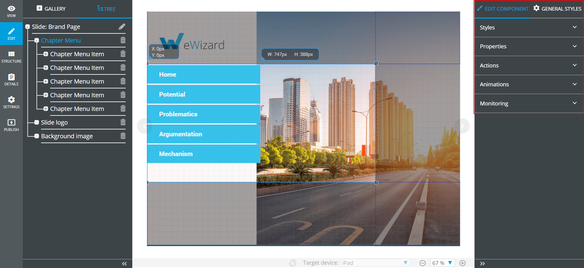
To edit an element, select it on the presentation slide or in the TREE.
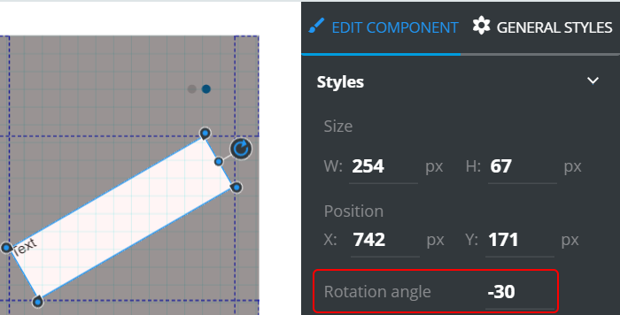
eWizard supports rotation of some components (Text, Textarea, Input, etc.). The supported components can be rotated in two ways:
- The
Rotationangle parameter editing in theStylesslide-down:
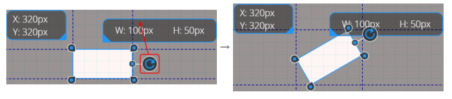
- The component rotation on the slide layout by moving the
 icon of the component:
Component settings
Each component may contain up to five categories (depending on the component):
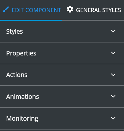
Styles contains the styling settings of the selected component. The settings list depends on the selected component.
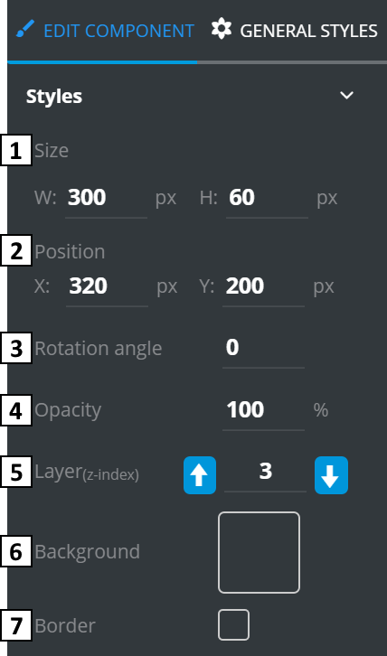
Size– defines width and height of selected component (in pixels).Position– defines the position of selected component (in pixels). The position of a selected item can be changed manually using the arrow keys or a combination of “SHIFT+arrow key” on your keyboard (moves by ten pixels).Rotation angle– defines the component rotation angle (from -179 to 180).Opacity– defines the transparency of selected component (as percentage).Layers– defines the layer containing the element. If the component is located in the “highest” layer (largest number), it will be displayed above in the forefront of other components.Background– allows adding and editing background images (or creating your own color schemes).Border– defines the border availability. If the border is enabled, shows the border styling tools:
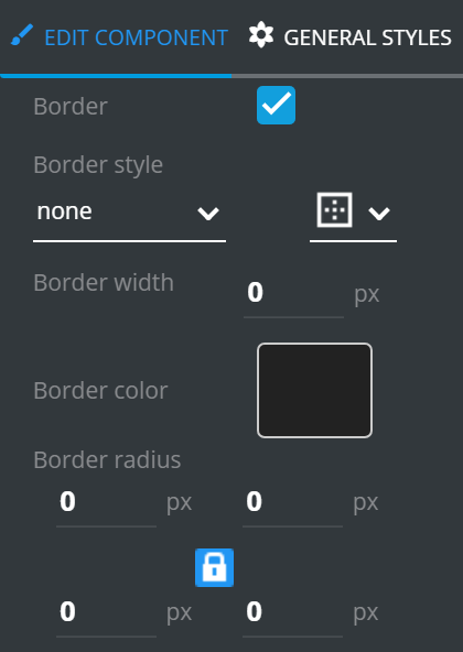
Border style– type of the border line (solid, dotted, dashed etc.) and sides of the bordering (left, right, top, bottom, all).Border width– width of the border line (in pixels).Border color– color of the border line.Border radius– radius for each corner of the border. Can be applied to all corners at once via icon press.
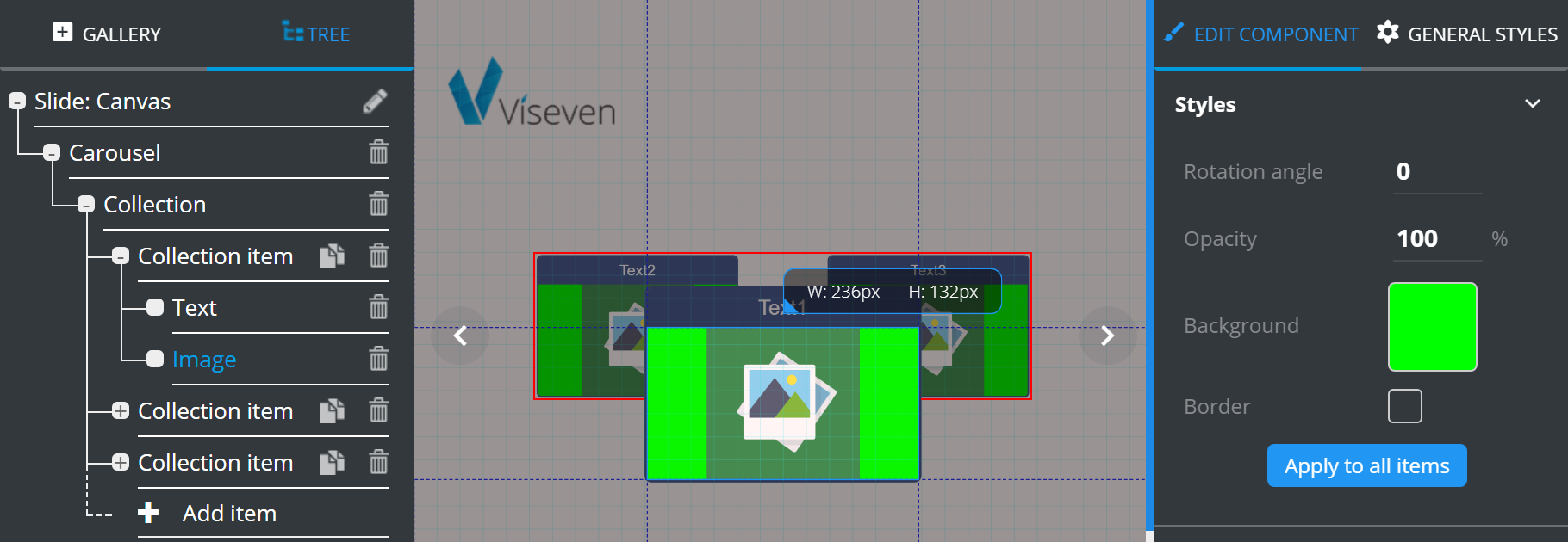
If you create the custom style for an item, you can apply the style to the rest of the items in the specific component. The Apply to all items feature is available for the components in the root of any Collection item.
To use this feature, click Apply to all items in Styles menu of edited component.
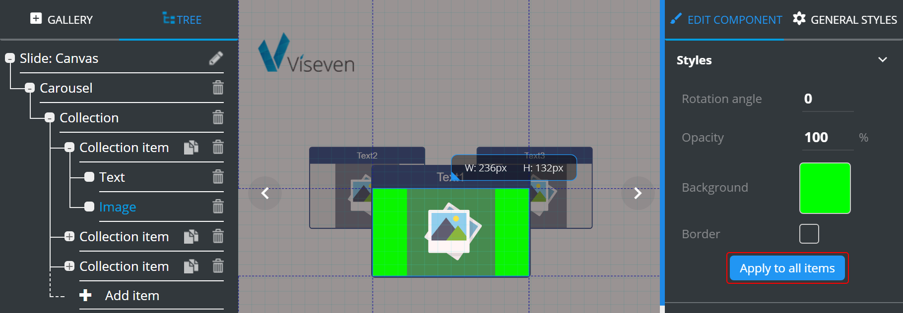
The component styling is applied to all the relevant components of the Collection items.
Properties contains unique editable features of each component type. The variety of tools depends on the complexity of the selected component.
Actions serves to define behavior rules for interactive elements. For example, you would use “Action” menu to define presentation behavior on tapping a button. First, you need to select a binder for the required activity (you can add several binders to one item). Each binder contains a specific set of parameters:
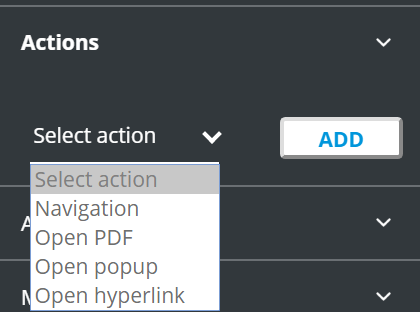
To activate the action settings:
- Select the necessary action.
- Click
Add.
Navigation – contains tools for configuring navigation between slides.
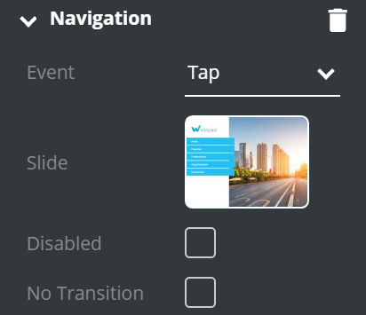
Event– defines the event that will start the action.Slide– is used to set up the connection/redirecting functionality of an element to a particular slide.Disabled– if ticked, the interactive element becomes disabled.No Transition– disables transition animation.
Optional property:
ID of presentation– ID for a cross-presentation navigation in some CLMs.
Open PDF – contains tools for opening PDF-files by performing selected action.
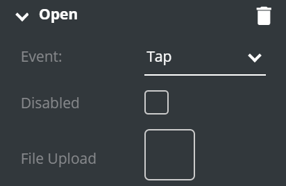
Event– defines the event that will start the action.Disabled– if ticked, the interactive element becomes disabled.File Upload– opens Digital Assets, where you can select the required PDF file.
Open pop-up – contains tools for adding pop-ups (works only if there are pop-ups present on the slide).
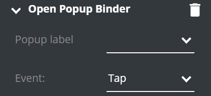
pop-up label– field for pop-up selecting (pop-up should be previously added to the slide).Event– defines the event that will start the action.
Open hyperlink – contains tools for adding hyperlinks to the component.
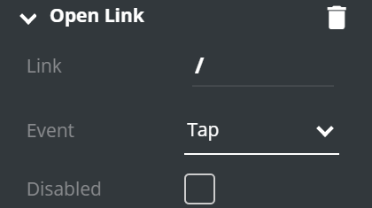
Link– field for entering URL.Event– defines the event that will start the action.Disabled– if ticked, the link becomes disabled.
Animations is available for most elements and contains configuration of animation behavior:
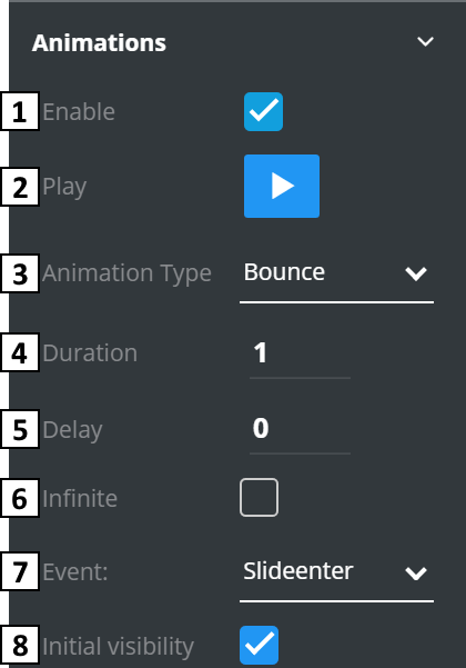
Enable– if marked, animation enabled and it's settings shown below.Play– clicking the icon () shows the animation.Animation Type– specifies the animation type.Duration– defines the animation duration.Delay– defines the delay before the animation start.Infinite– if enabled, animation will be playing continuously.Event– defines the event that activates the animation.Initial visibility– defines the initial animation state. If enabled, the initial animation state will be “visible”.
Monitoring allows monitoring configuration (KPI transfer) for different CLM systems.
Background
Background is a basic property that can be added to almost any element in your presentation. It offers tools for adding and editing background images or creating your own color schemes.
Edit background form contains the following tools and options:
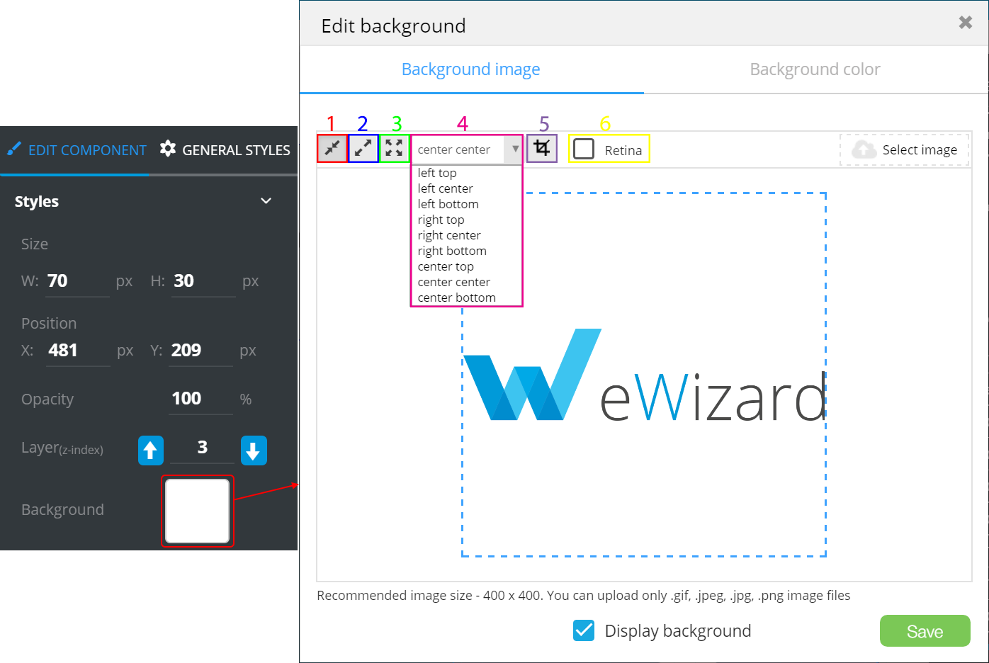
 – fit the image to the canvas size.
 – use the image in full size.
 – stretch the image to fill the slide or component.
- Image alignment.
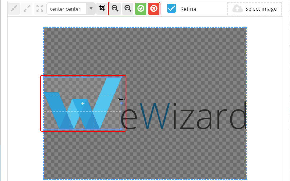
Retinaoption enables images saving in high pixel format (for iOS displays). – crop the image. To apply cropping, click
  . To discard cropping, click
  .
.
Select image opens the Digital Assets form, where you can upload a new image ( ) or select one available.
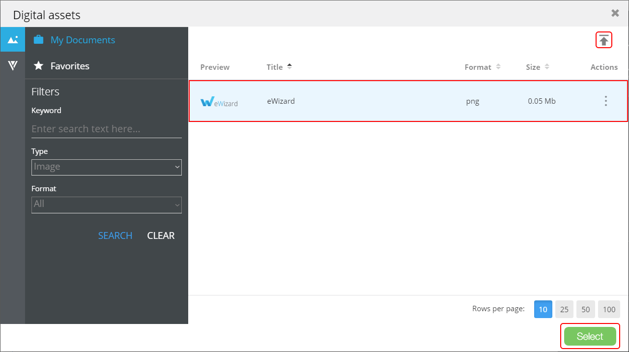
Click Select.
To customize the background, proceed to the Background color tab.
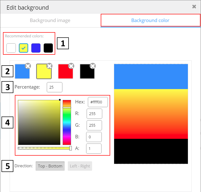
- Recommended colors (usually those branded) list defined by the presentation developers.
- Colors set (four max).
- Percentage of slide that will be filled with the selected color. Set the maximum of the image share to be filled with each color. Say, if you need to evenly fill the image with four colors, then set the colors percentage as follows: 25 for Color1, 50 for Color2, 75 for Color3 and 100 for Color4.
- Custom color picker (uses RGB-scheme).
- The direction of color arrangement.
You can find the recommended image resolution and acceptable file formats at the bottom of edit window.
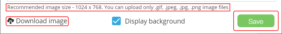
If an image is already used as the background, you will find the Download image button.
To download image on your PC, click Download image.
The Display background option hides/displays the background element (present on all tabs).
Click Save to apply the background settings.